
25 Brand guidelines examples to inspire your brand book
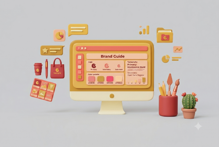
TABLE OF CONTENTS

TL;DR
The best brand book examples don't just show what a brand looks like. They explain why every decision was made, and they make it impossible to apply brand elements incorrectly. This roundup covers 25 brand books from Mailchimp, Spotify, Airbnb, NASA, and more. What they share: each one is built for the people creating brand materials every day, not just for the designers who built the brand. The standout technique across nearly all of them is showing real usage examples alongside the rules, not just the rules alone.
Introduction
Your designer gets it. Your freelancer doesn't. Your social media manager is somewhere in the middle. Without a shared brand book, every person touching your brand is working from their own interpretation of what your brand looks and sounds like.
These 25 brand guidelines examples show what good looks like. Not just visually, but structurally. Each one is worth studying for a specific reason: how they handle co-branding governance, why they chose a particular color system, or how they make brand elements impossible to misapply. We've pulled examples across tech, consumer goods, food, finance, and institutional design to show that there's no single right approach, just consistent underlying principles.
{{BRAND_PORTFOLIO="/dev/components"}}
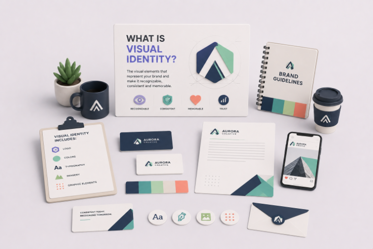
What is a brand book?
A brand book is a document that defines how a brand looks, sounds, and presents itself across every touchpoint. It covers logo usage, color palette, typography, photography style, voice and tone, and how all of these elements work together. Anyone creating brand materials, from an in-house designer to an external agency to a freelance contractor, should be able to open the brand book and know exactly what's allowed and what isn't.
The terms "brand book," "brand guidelines," and "brand style guide" are used interchangeably by most companies. There are loose distinctions worth knowing:
In practice, a brand book is a more complete version of a style guide. Both exist to answer the same question: when someone picks up your brand assets, do they know exactly how to use them?
Why consistency matters: Research from Marq found that consistent brand presentation across all channels can increase revenue by up to 23%.
What is included in a brand guide?
A complete brand book covers seven core areas: logo standards, color palette with exact codes, typography rules, imagery guidelines, voice and tone, mission and values, and real usage examples showing what's allowed and what isn't. More comprehensive brand books also include co-branding rules, downloadable templates, and governance guidelines for external partners.
The quality of a brand book isn't measured by how many elements it covers. It's measured by whether the people using it can apply the brand correctly without asking follow-up questions. The 25 examples below each do that in their own way.
25 Brand book examples worth studying
Let’s take a look at some branding guide examples so we can analyze what makes a good brand guide.
These examples come from a range of industries: tech, consumer goods, food, finance, and global institutions. What they share is that each one solves a specific brand consistency problem. Some are comprehensive, some are one-pagers. All of them show something worth taking from.
Tech and SaaS brand books
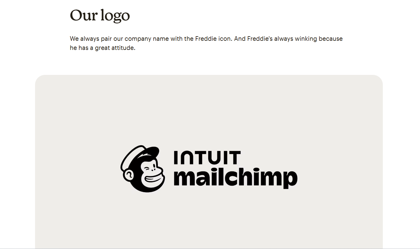
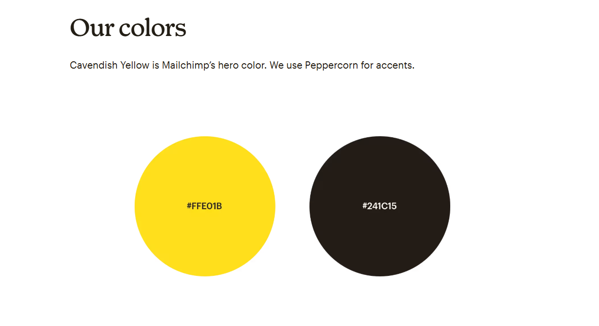
1. Mailchimp
Mailchimp's brand guidelines are among the most-studied examples in SaaS marketing. The voice and tone section is unusually specific: rather than describing how Mailchimp should sound, it shows side-by-side examples of on-brand and off-brand copy so designers and writers can see the difference immediately. Cavendish Yellow is the hero color, with Peppercorn used for contrast. The Freddie icon (the winking chimp mascot) has strict rules about when it can appear without the wordmark alongside it. The reasoning behind these rules is documented, not just the rules themselves, which is what makes the guidelines genuinely usable rather than just readable.
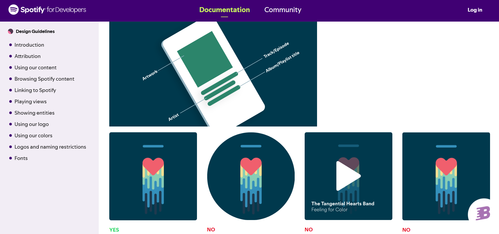
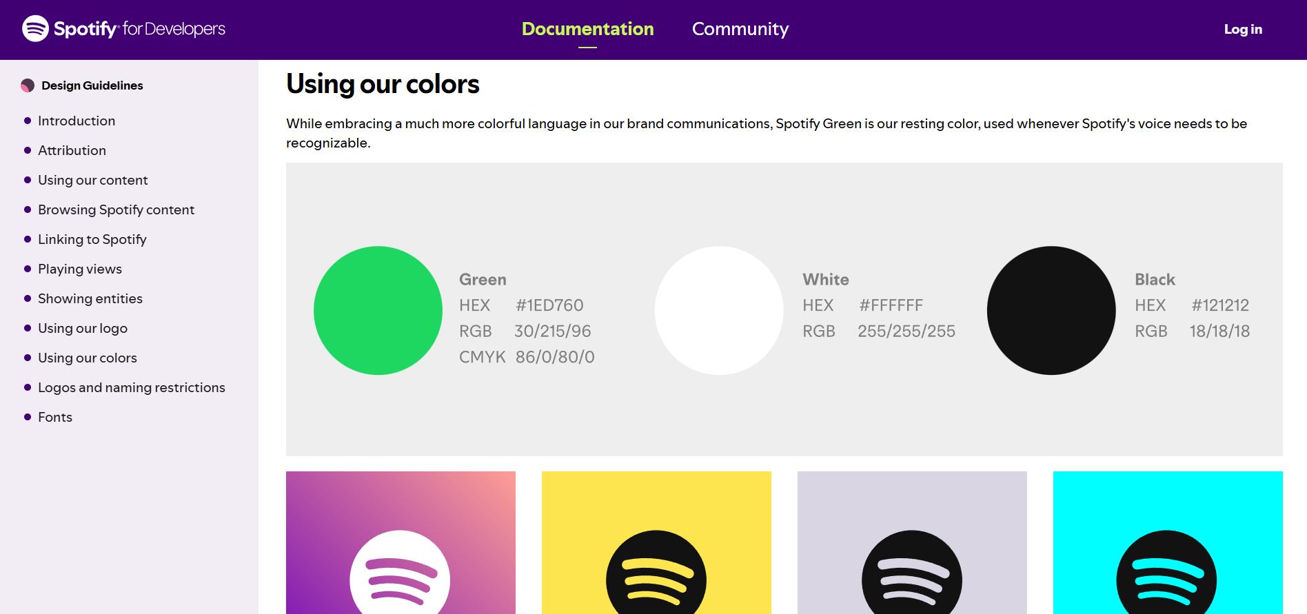
2. Spotify
Spotify's brand book is built around a use case most brands ignore: external partners. The guidelines are designed for third-party developers, marketing collaborators, and co-branding situations, which means they're practical in a way that internal-only brand books rarely are. Three approved background colors (green, black, white). One logo shape (circular). Specific RGB codes for use in partner platforms. Simple enough to apply correctly without a brand conversation. Spotify understands that its brand lives in other people's hands as much as its own, and the guidelines reflect that reality.
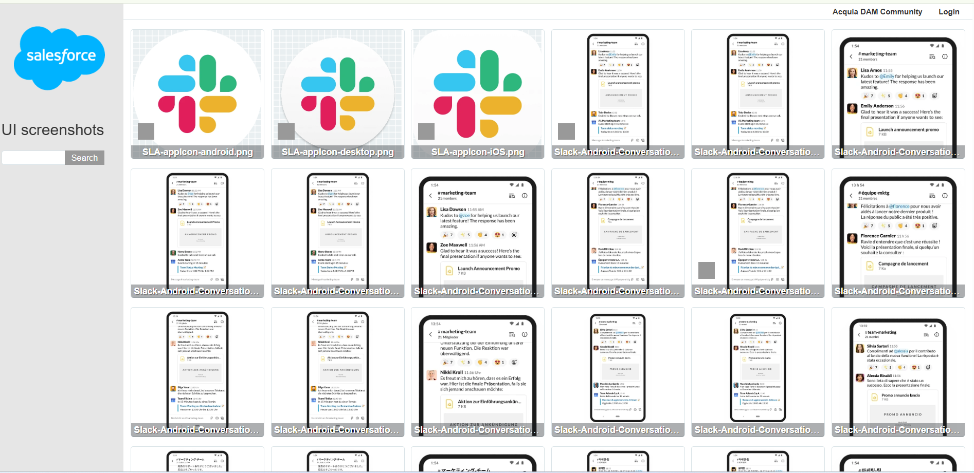
3. Slack
Slack handles co-branding governance better than almost any other SaaS brand. The brand book defines exactly how the Slack brand can appear alongside partner brands, including visual hierarchy rules and spacing requirements for co-branded applications. The guidelines also cover branded themes in the product interface itself, which is rare. Most brand books stop at marketing materials. Slack's extends to how the product looks inside, which keeps brand consistency at the highest point of user contact. For companies building partner ecosystems or integration marketplaces, this is the model to study.
4. Dropbox
Dropbox structures its brand book around four zones: brand strategy, foundational elements, design system, and writing. The standout section is the customer journey lens: the guidelines tell designers which visual style to use depending on where a customer is in their relationship with Dropbox, using illustrations for the product and photography for marketing. That one rule prevents most of the brand drift that happens when designers make independent style choices. The writing guidelines section, rare in visual brand books, is equally thorough. Find it at dropbox.design.
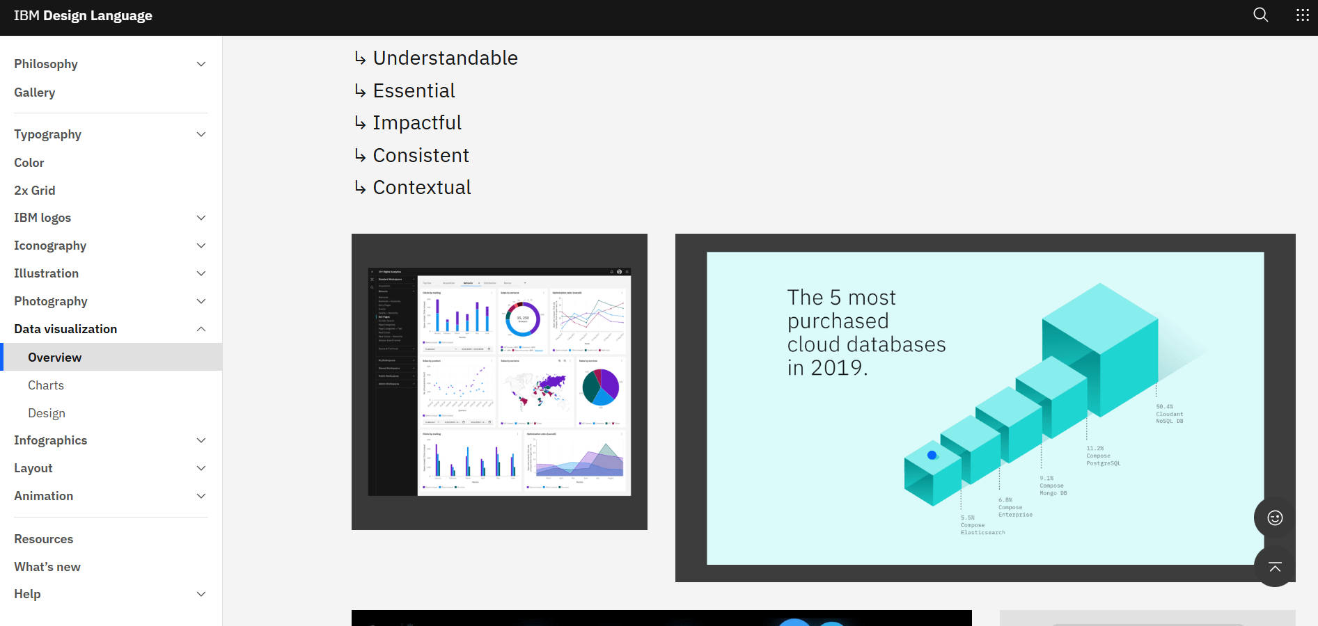
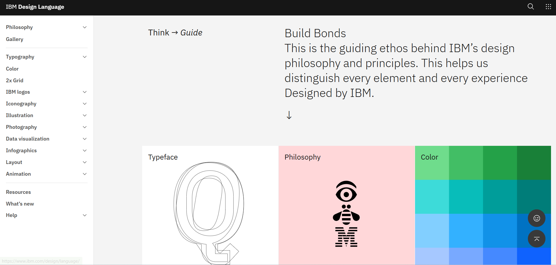
5. IBM
IBM's design language documentation is one of the most comprehensive brand systems in enterprise tech. The data visualization section is genuinely unusual: IBM specifies which chart types to use, how to apply the brand color hierarchy to data displays, and how to maintain readability at scale. There's also a "what's new" section that logs recent updates to the guidelines, which solves one of the most persistent brand book problems: teams not knowing what's changed or which version is current. IBM treats its brand standards as a living system, not a static document.
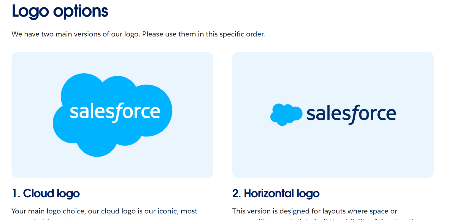
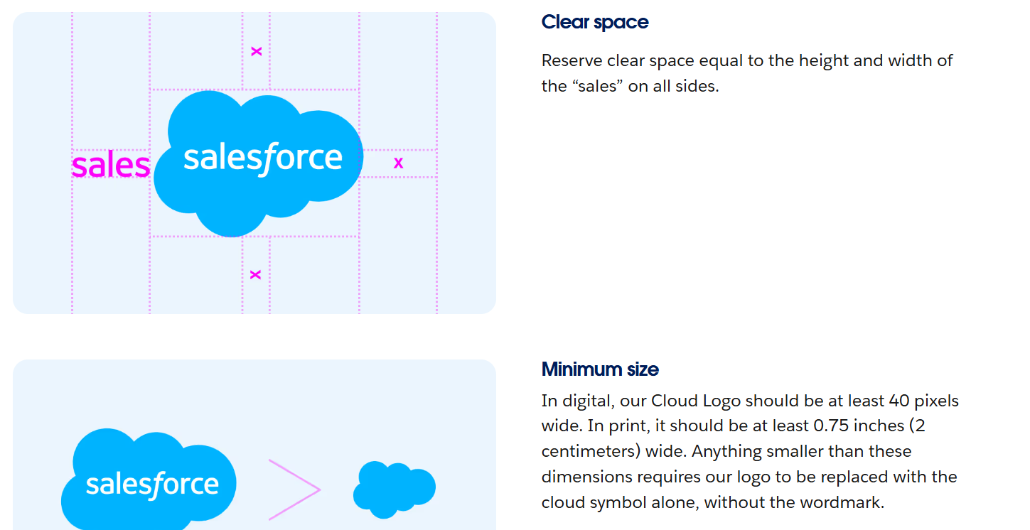
6. Salesforce
Salesforce's brand guidelines are built for an organization where hundreds of people create brand materials across dozens of teams globally. Every section is self-contained, independently downloadable, and accompanied by visual examples of correct and incorrect application. The navigation breaks the brand into independent modules (voice, colors, typography, logo) rather than a linear document, so someone looking for one specific answer can find it in under a minute. At this scale, the usability of the brand book is itself a brand asset. Salesforce gets that. Available at brand.salesforce.com.
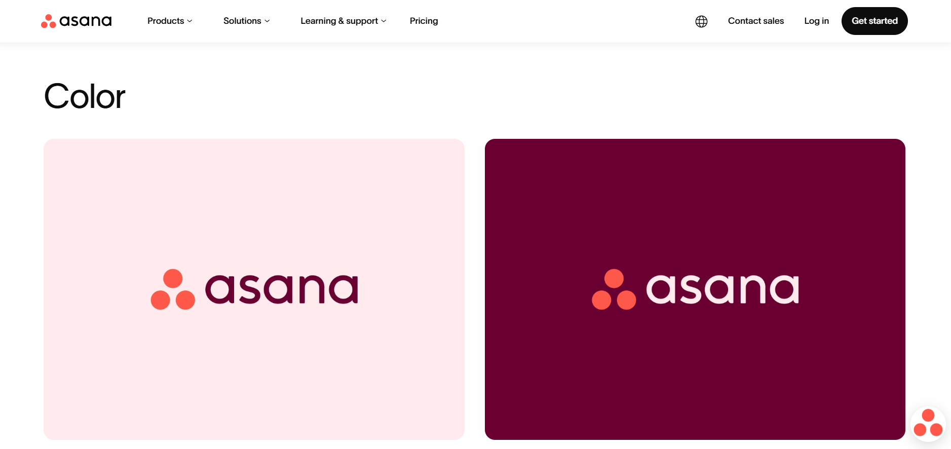
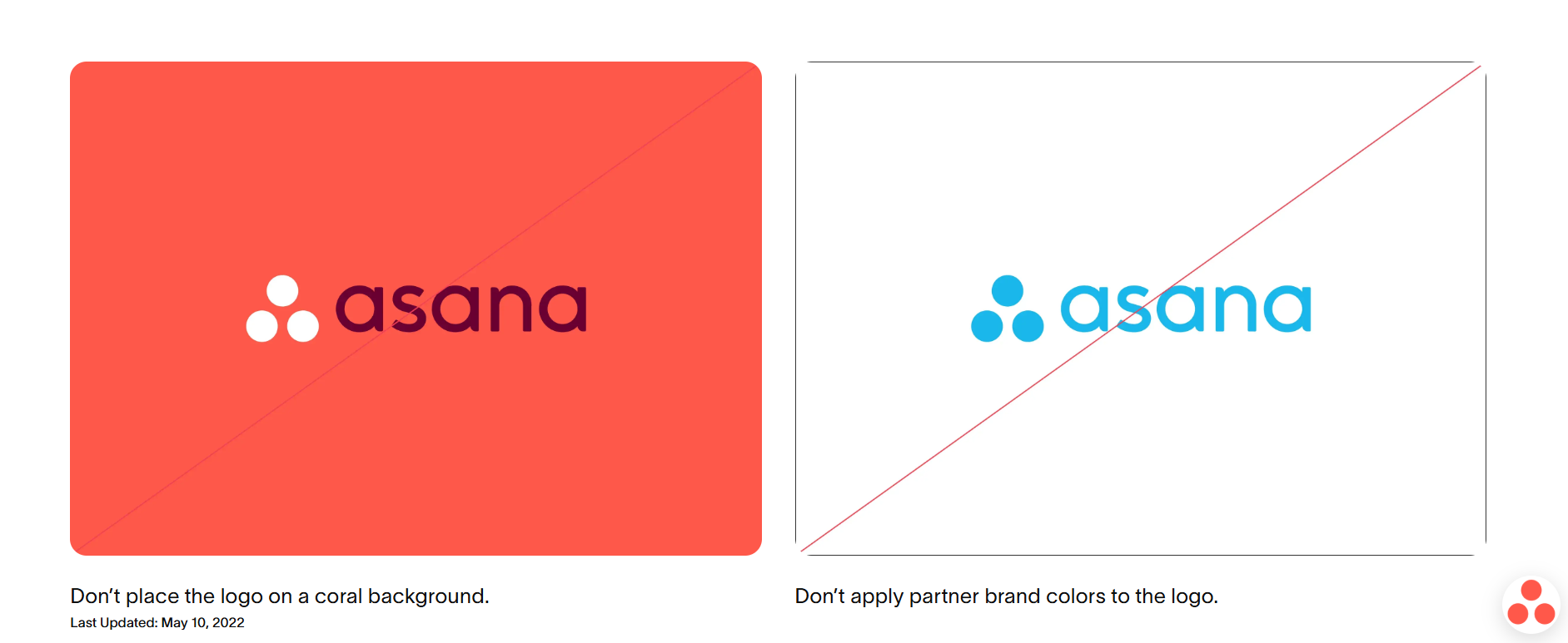
7. Asana
Asana's brand guidelines explain the logo's meaning before they explain the logo's rules. The three dots in the Asana mark represent the limitless potential of human collaboration, and that context appears before any usage guidelines do. This matters more than it sounds. When designers understand why a logo exists, they make better decisions about how to apply it in situations the guidelines don't explicitly cover. Most brand books state what the logo is. Asana explains why it is, which produces better creative work from everyone using the system.
Consumer and lifestyle brand books
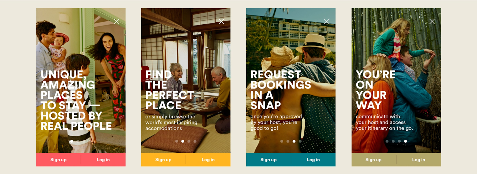
8. Airbnb
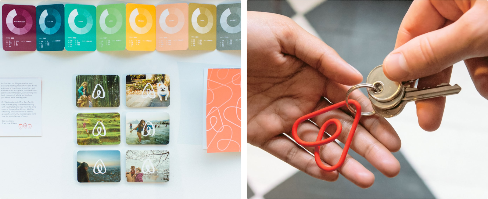
The Bélo symbol at the center of Airbnb's brand identity has a documented origin story. The guidelines treat the logo as a concept, not just a graphic, and that framing is what keeps it consistent across every country Airbnb operates in. The brand book includes specific co-branding rules for how Airbnb's identity should appear alongside host brands and partner logos, with clear guidance on visual weight and clearance requirements. For a company whose brand lives on other people's properties and platforms, getting co-branding right is essential. The guidelines make it systematic rather than case-by-case.

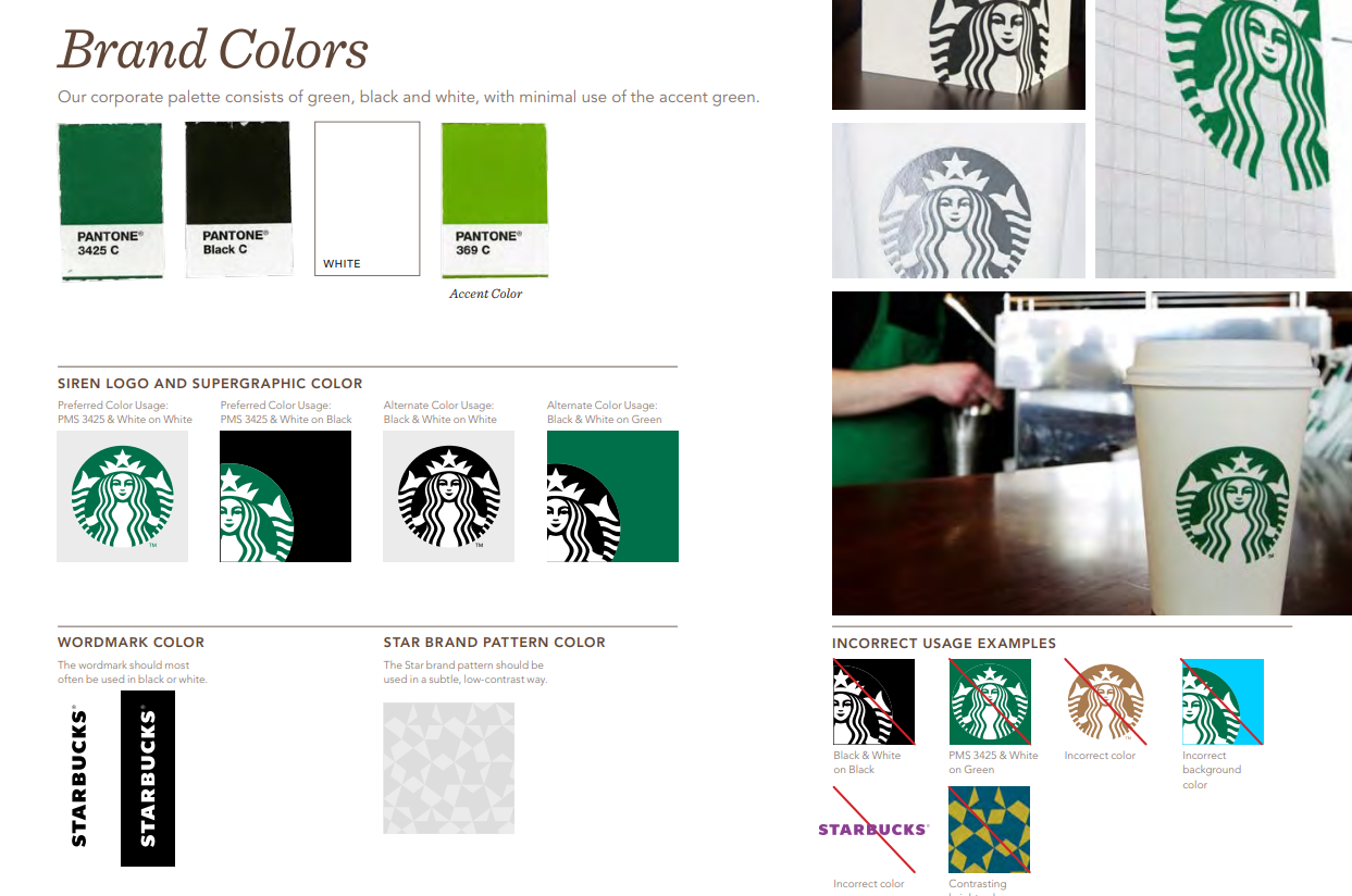
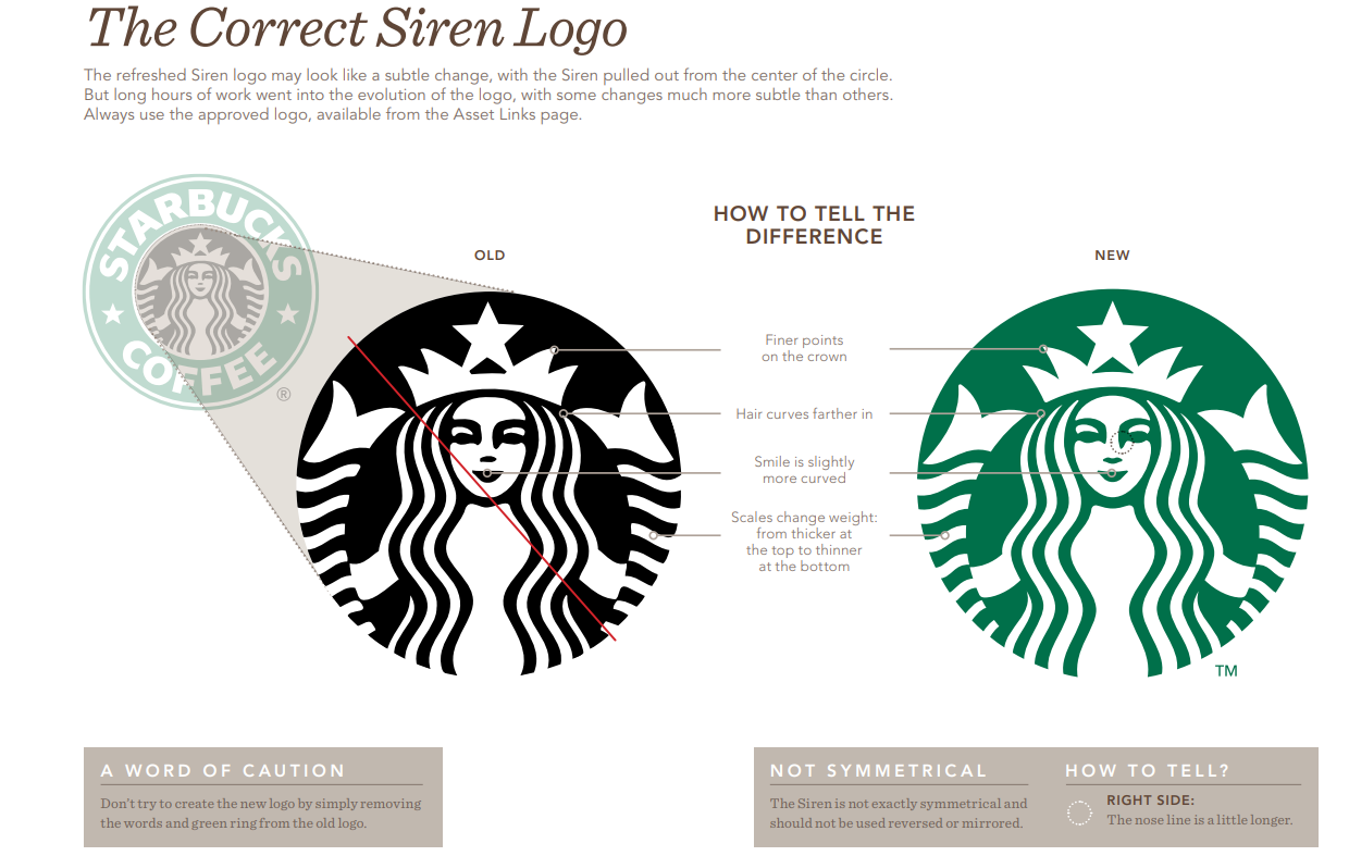
9. Starbucks
Starbucks opens its brand guidelines with philosophy, not design rules. Before any color code or font specification appears, the document explains what Starbucks stands for. The brand book also covers something almost no other brand documents: an audio identity, including how the Starbucks brand should sound in stores and digital environments. In-use examples across multiple campaign formats follow, alongside a note that certain brand elements can be customized within defined limits, giving creative teams room to work without going off-brand. One of the few brand books that covers sensory identity beyond the visual. At creative.starbucks.com.
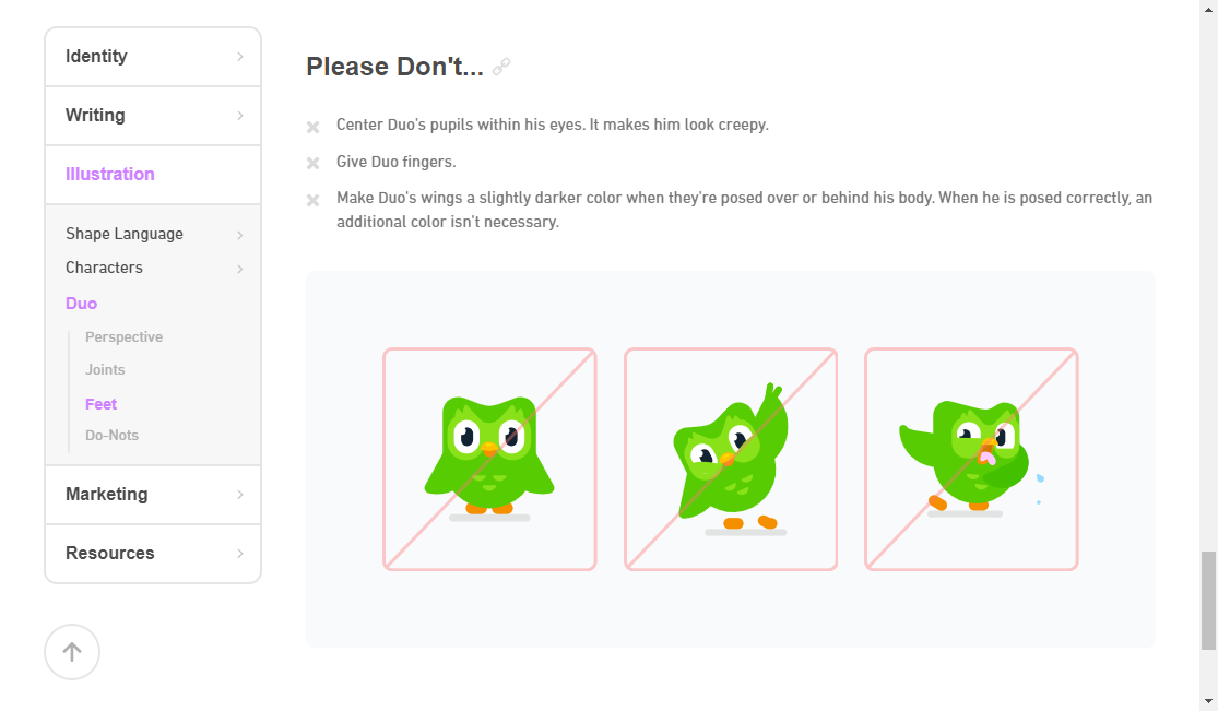
10. Duolingo
Duolingo's brand book is mascot-first. Duo the owl has his own section, his own approved poses, and his own personality documentation.
The guidelines treat the mascot with the same rigor as the logo: specific emotion guidelines, approved expressions for different contexts, and do/don't examples for every market Duolingo operates in. The green logo color is documented with context (it reinforces a sense of growth and learning progress), not just hex codes. Mascot-led brands lose consistency quickly as they scale. Duolingo avoids that by building mascot rules directly into the brand system at the same level as the core visual identity.
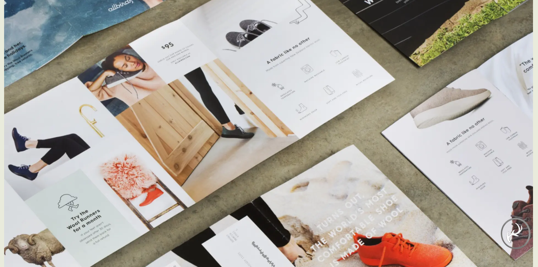
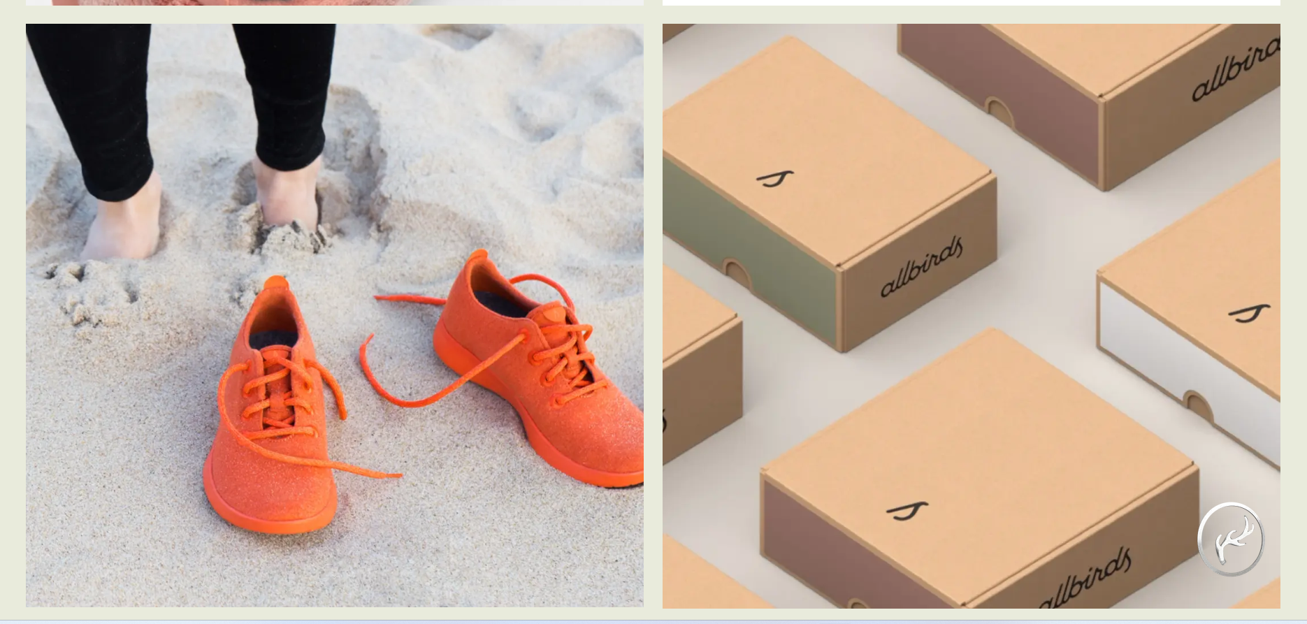
11. Allbirds
Every visual decision in Allbirds' brand system is tied back to the sustainability narrative. The earthy color palette (greens, blues, and browns representing earth, water, and trees) isn't aesthetic preference. The photography guidelines specify natural lighting and natural settings. Custom graphics use organic shapes. The brand book doesn't just tell designers what to use. It explains why these choices reinforce the brand story, which means even new creative partners can make brand-consistent decisions without a full briefing. That's a harder thing to document than color codes, and Allbirds does it well.
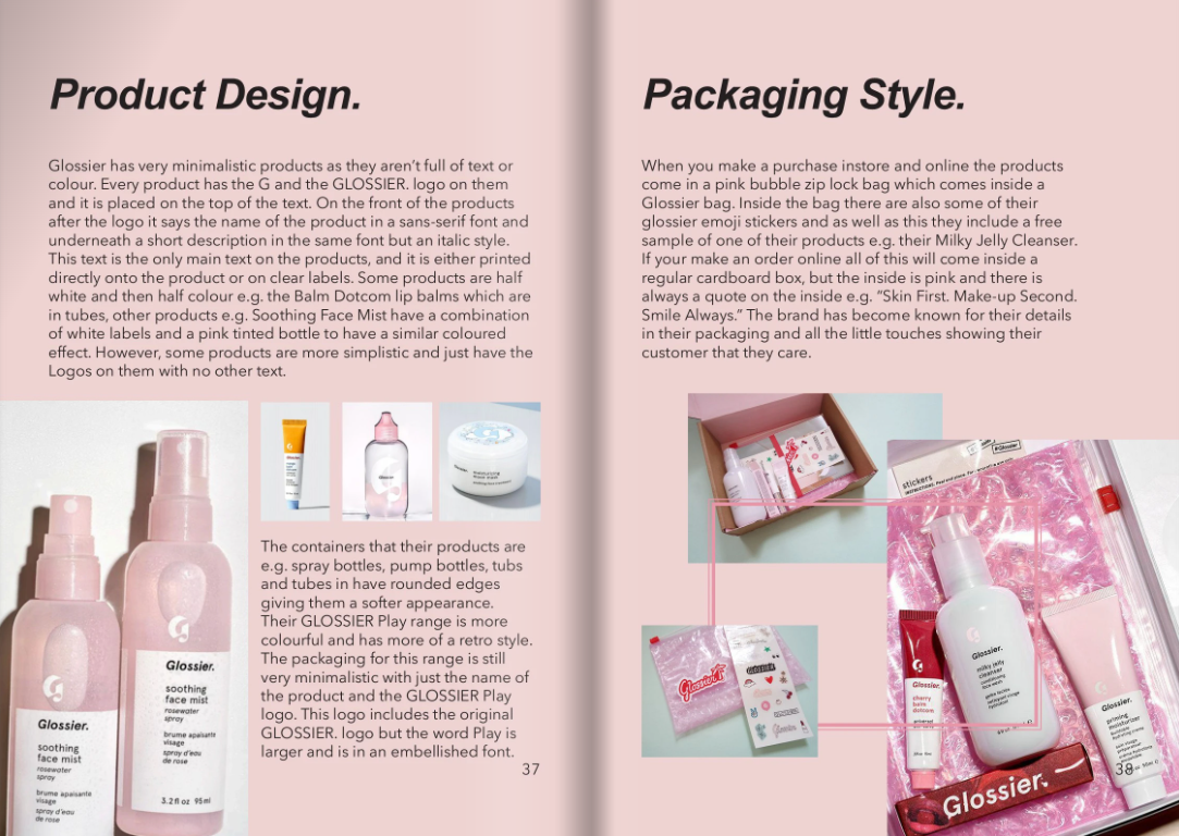
12. Glossier
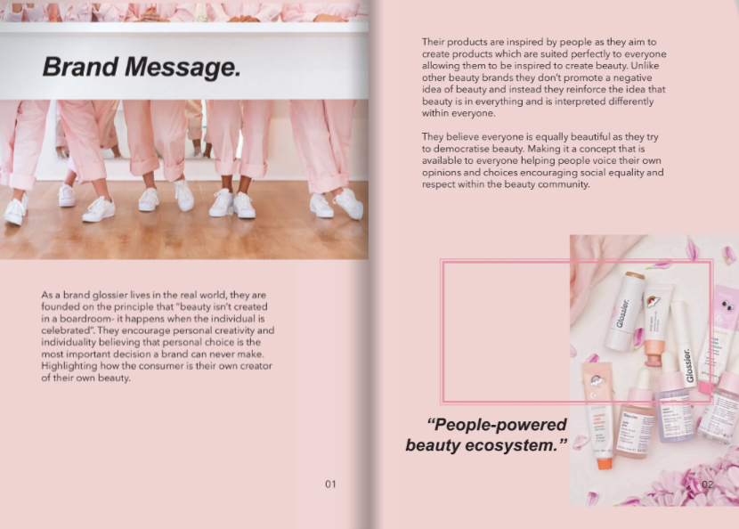
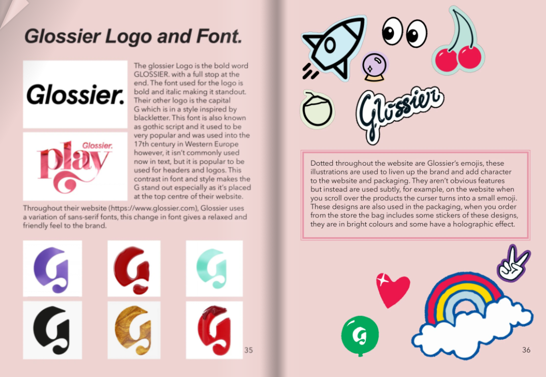
Glossier's brand guidelines are self-demonstrating. The document itself follows every rule it describes: minimal design, heavy white space, clean typography, no visual clutter. The do/don't examples for logo usage and color application are unusually specific, down to minimum logo sizes and approved color combinations that a non-designer can apply correctly on the first attempt. Reading the Glossier brand book feels like being inside Glossier marketing, which is intentional. The best brand guidelines don't just document the brand. They perform it.
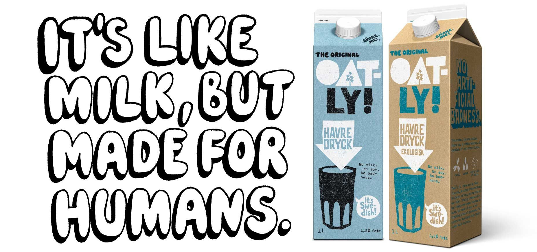
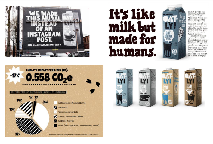
13. Oatly
Oatly manages the rare achievement of a comprehensive one-page brand document. It covers acceptable fonts, phrases, illustrations, and color combinations in a format that's faster to read than most brand books' table of contents. The bubbly illustration typography is front and center because it's the most distinctive and most imitated element of the Oatly visual identity. Real product packaging examples give designers immediate context for how the rules apply. More isn't always better in a brand book. Oatly makes the case for concision.
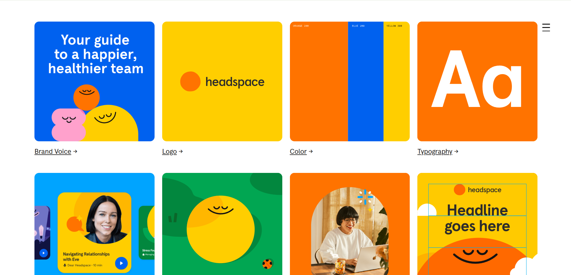
14. Headspace
Headspace's brand guidelines look the way the product feels. Calming. Spacious. Light on words. The document leads with imagery and animation guidelines rather than logo rules, which reflects how the Headspace brand actually lives in the world: through the visual and audio experience of the app itself. White space is used deliberately throughout the document, making the guidelines feel considered rather than corporate. Most brand books treat design elements as equally weighted. Headspace makes clear that imagery and motion are the brand's primary language, and the document structure reflects that priority.
15. Ben and Jerry's
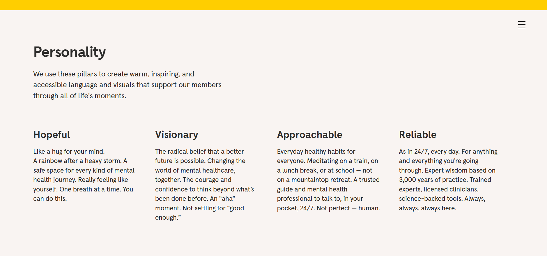
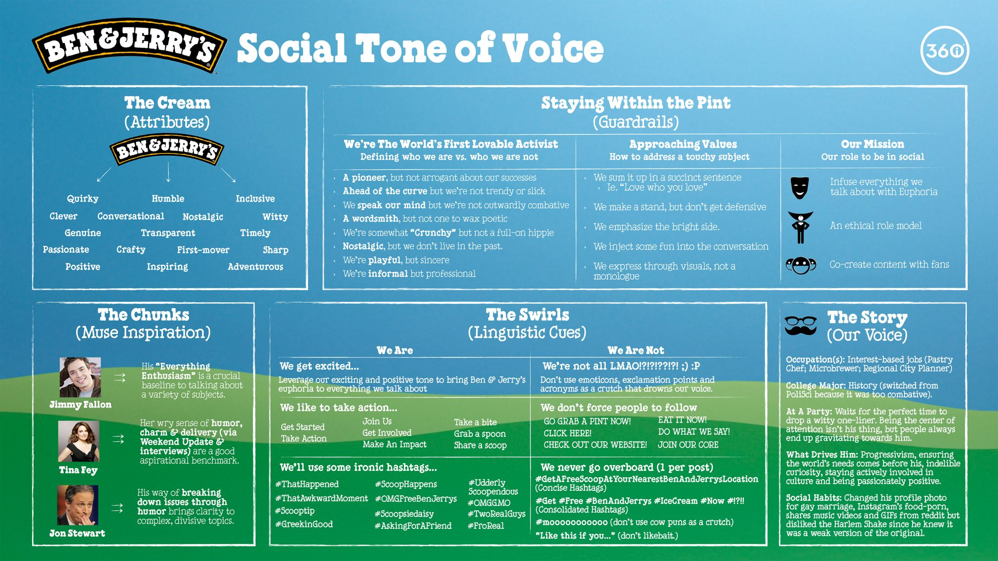
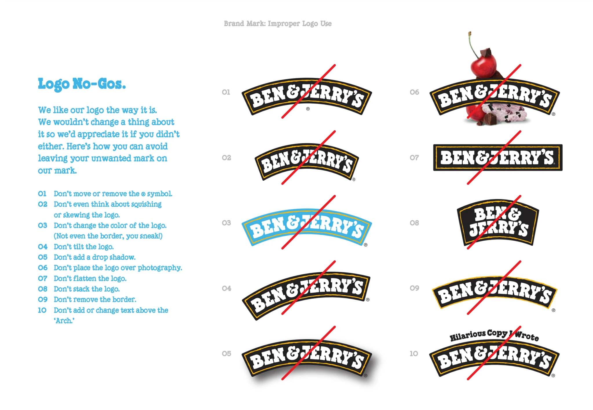
Ben and Jerry's brand book is one of the few that works as actual reading material. The guidelines capture humor, irreverence, and social and political positioning alongside the standard visual specs, because for Ben and Jerry's, the brand voice is as distinctive as the packaging design. The color palette is vivid and deliberate. The tone of voice section goes further than most, documenting how the brand approaches social topics as a core part of its identity rather than an afterthought. For any brand where personality is the primary differentiator, this is the model worth studying.
Iconic and institutional brand books
16. Netflix
Netflix uses a tiered access model that's worth studying even for brands without Netflix's global reach. The logo and basic brand marks are publicly downloadable. Other brand assets, including campaign materials and UI elements, require a formal access request. This governance structure isn't bureaucratic overhead. It's how Netflix maintains brand consistency at scale without needing to manually approve every partner use. The logo usage guidelines, covering spacing, prohibited treatments, and approved lockups, are detailed enough that most applications can be handled independently. Available at brand.netflix.com.


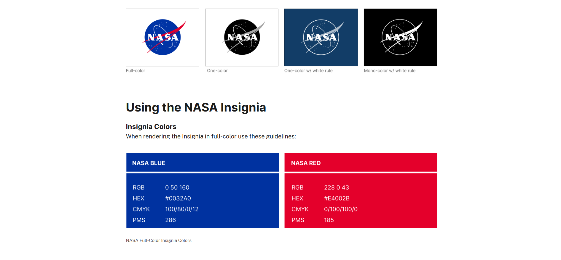
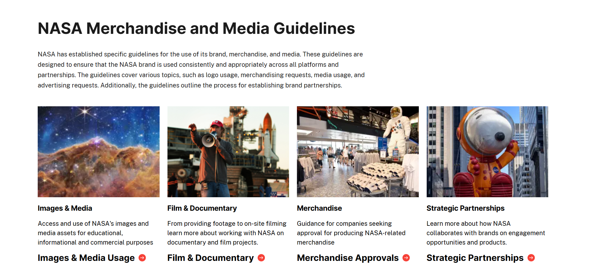
17. NASA
NASA's Graphics Standards Manual, created in 1975 by designers Richard Danne and Bruce Blackburn, runs 220 pages and documents every application of the "worm" logo across spacecraft, vehicles, signage, publications, and business cards. It's possibly the most-studied brand document in design history, not because it's visually spectacular, but because it's comprehensive and systematic in a way that very few brand books achieve. The manual was out of print for decades before being republished in 2015. Reading it today remains useful. Thorough documentation of visual decisions doesn't go out of date.
18. Uber
Uber's brand book is built around a single constraint: minimalism. Black and white as the dominant palette. Maximum clearance around the logo at all times. No visual noise. The spacing and clearance rules take up more space in the guidelines than the color or typography sections, which signals exactly what Uber considers most important: the relationship between the logo and the space around it. The guidelines also cover app UI and animation standards, treating the product experience as a brand asset rather than a separate design system. Minimalism is easy to describe and hard to maintain at scale. Uber makes it systematic.
19. Moleskine
Moleskine's monochromatic palette (black, white, and shades of grey) isn't aesthetic preference. It's a strategic constraint. The brand guidelines make the case for restraint: a limited palette maintains the premium, contemplative feel that Moleskine's audience expects, regardless of the product category or geographic market. Every visual decision reinforces the same positioning: sophisticated, functional, timeless. For brands trying to maintain a premium feel across a wide product range and multiple markets, Moleskine's approach to deliberate constraint is more instructive than most comprehensive brand books.


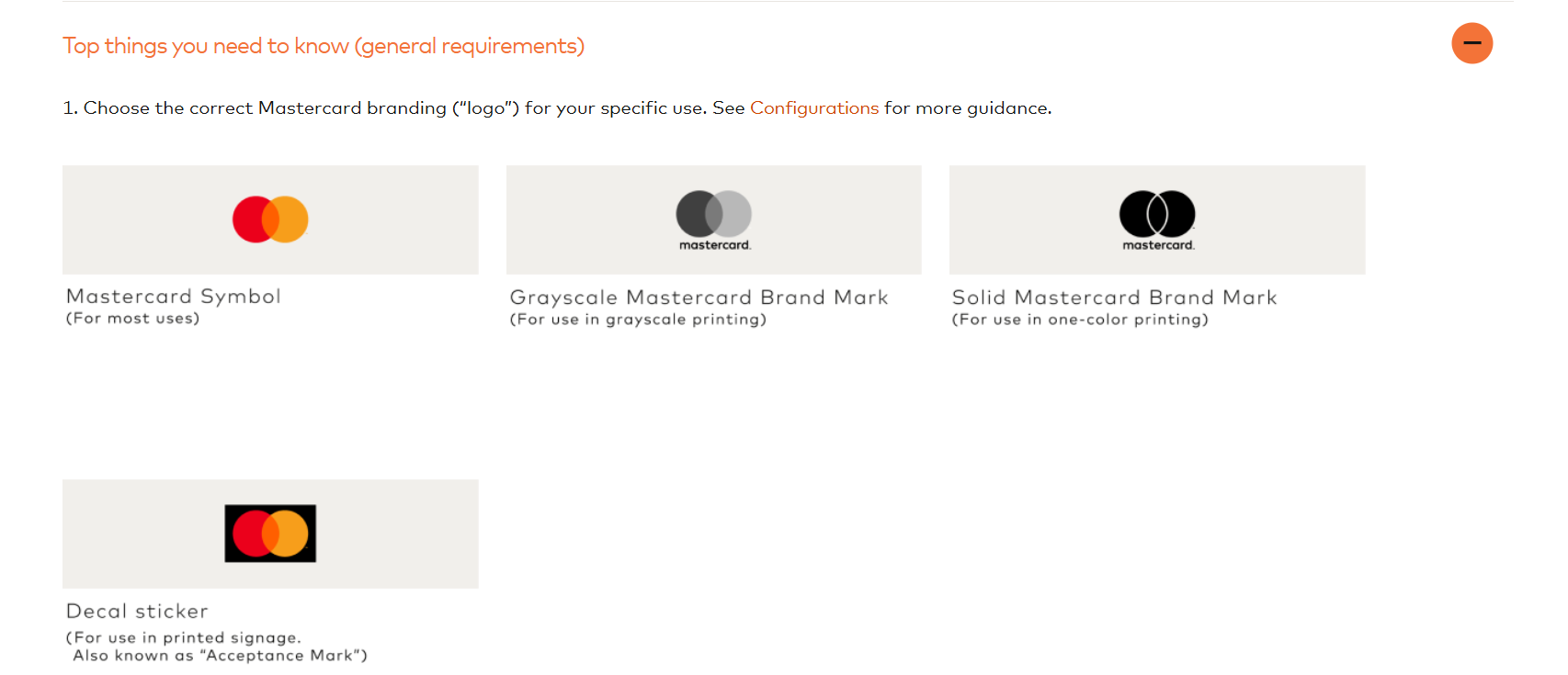
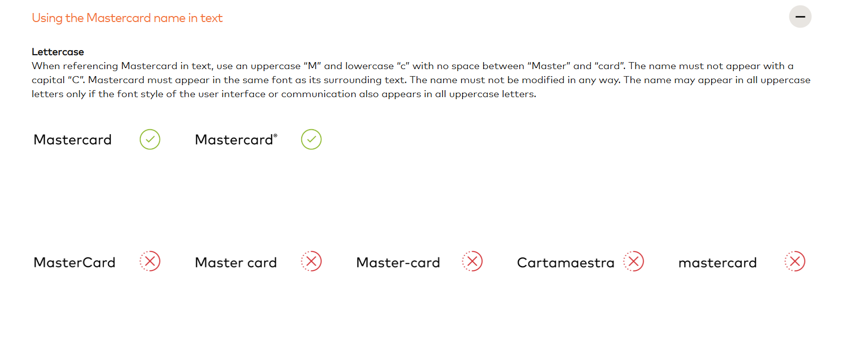
20. Mastercard
Mastercard's brand center opens with a summary of what's recently changed. This single design decision solves one of the most persistent brand book problems: teams working from outdated guidelines without knowing it. Most brand books are presented as static, authoritative documents. Mastercard treats its guidelines as a living system that internal and external teams need to track over time. The guidelines also include a dedicated FAQ section for navigating the most common questions without contacting the brand team. Governance built into the document itself, not bolted on afterward.
21. Instagram
Instagram's brand guidelines go deep on logo placement in ways most brands overlook. Significant space is dedicated to how the Instagram logo should appear alongside other logos: sizing relationships, spacing rules, and approved grouping formats for co-branded applications. This matters because the Instagram logo appears on billions of pieces of marketing created by accounts, advertisers, and partners. The gradient system that defines Instagram's visual identity is also documented with color codes and application rules that keep it consistent across different surfaces. A strong model for any brand whose identity lives in other people's content.
Challenger and fresh brand books
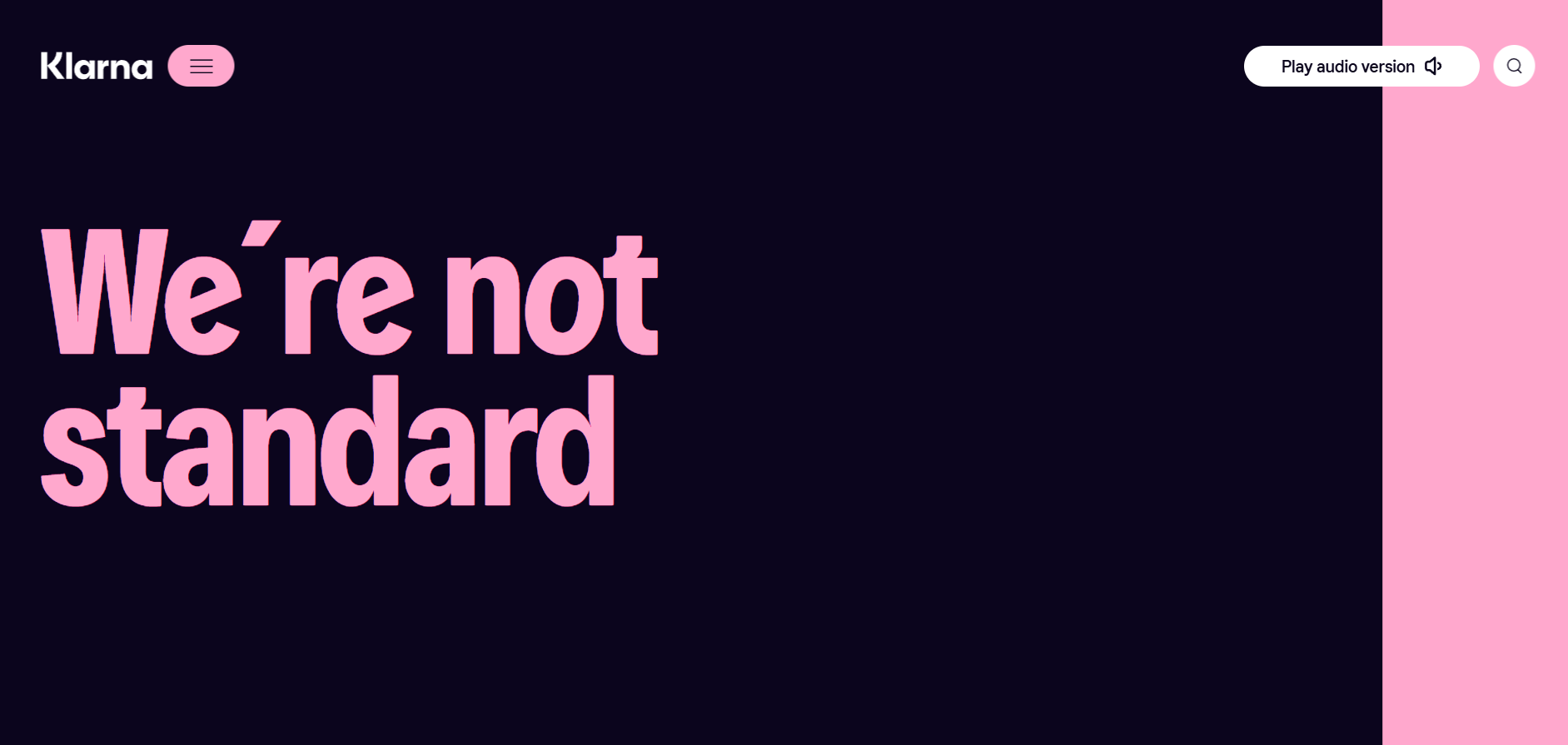
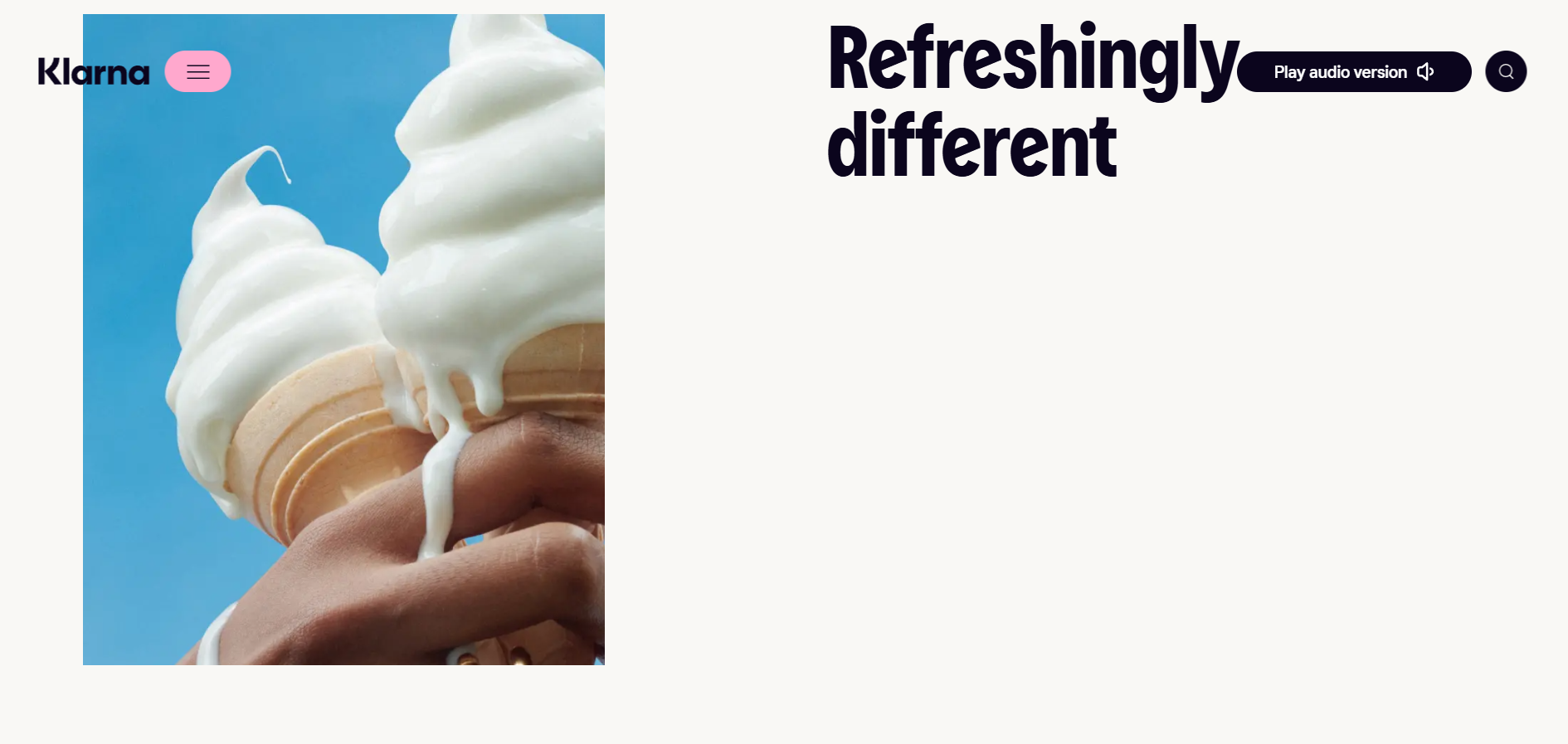
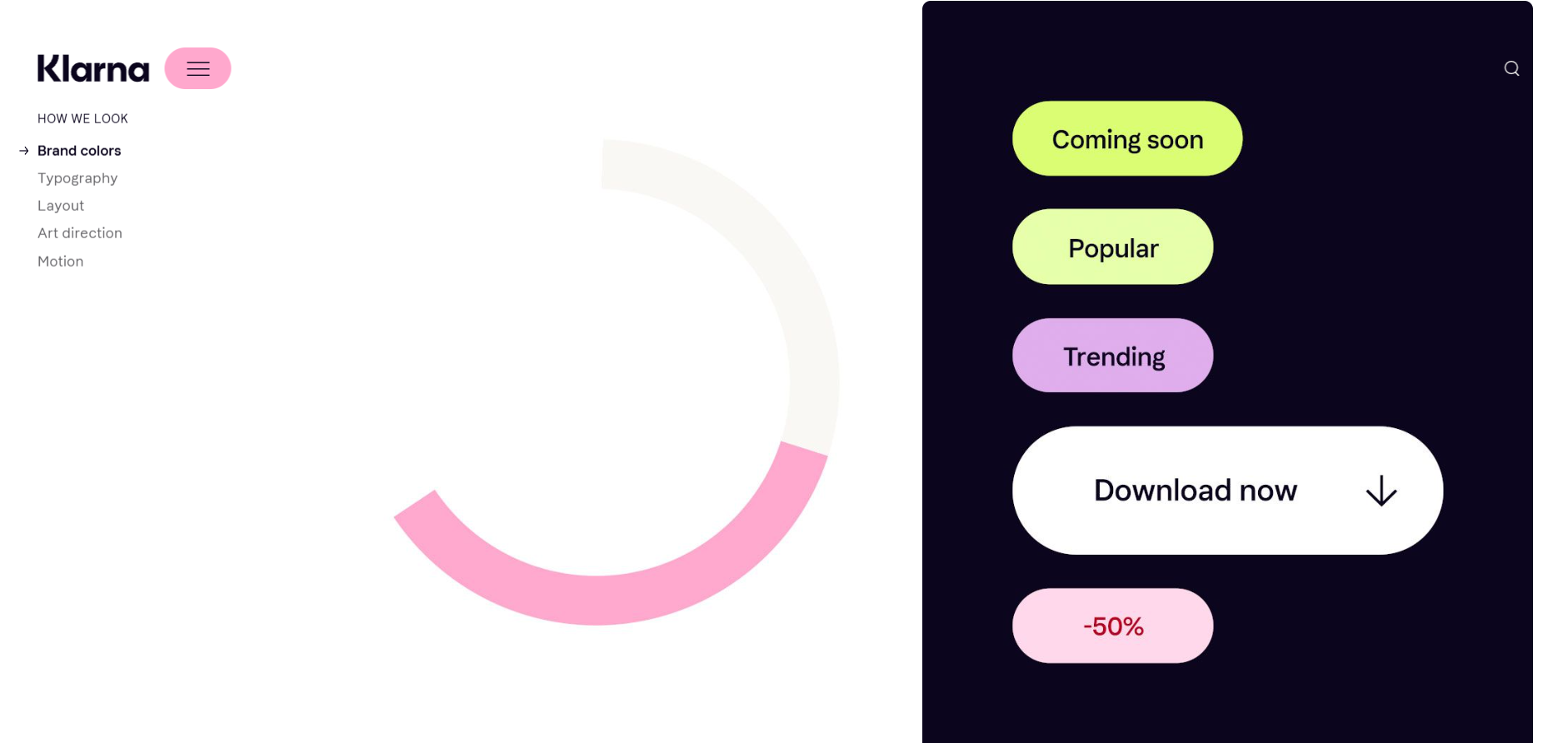
22. Klarna
Klarna opens its brand guidelines with a scrollable cover page showing the brand mission alongside actual campaign examples. Most brand books open with the logo. Klarna opens with the brand in action, which is more persuasive and more memorable as a first impression. The tone of voice section includes rewritten copy examples: original text alongside the Klarna version, with annotations explaining what changed and why. That format makes the voice guidelines immediately applicable rather than a description designers have to translate into real decisions on their own.
23. Casper
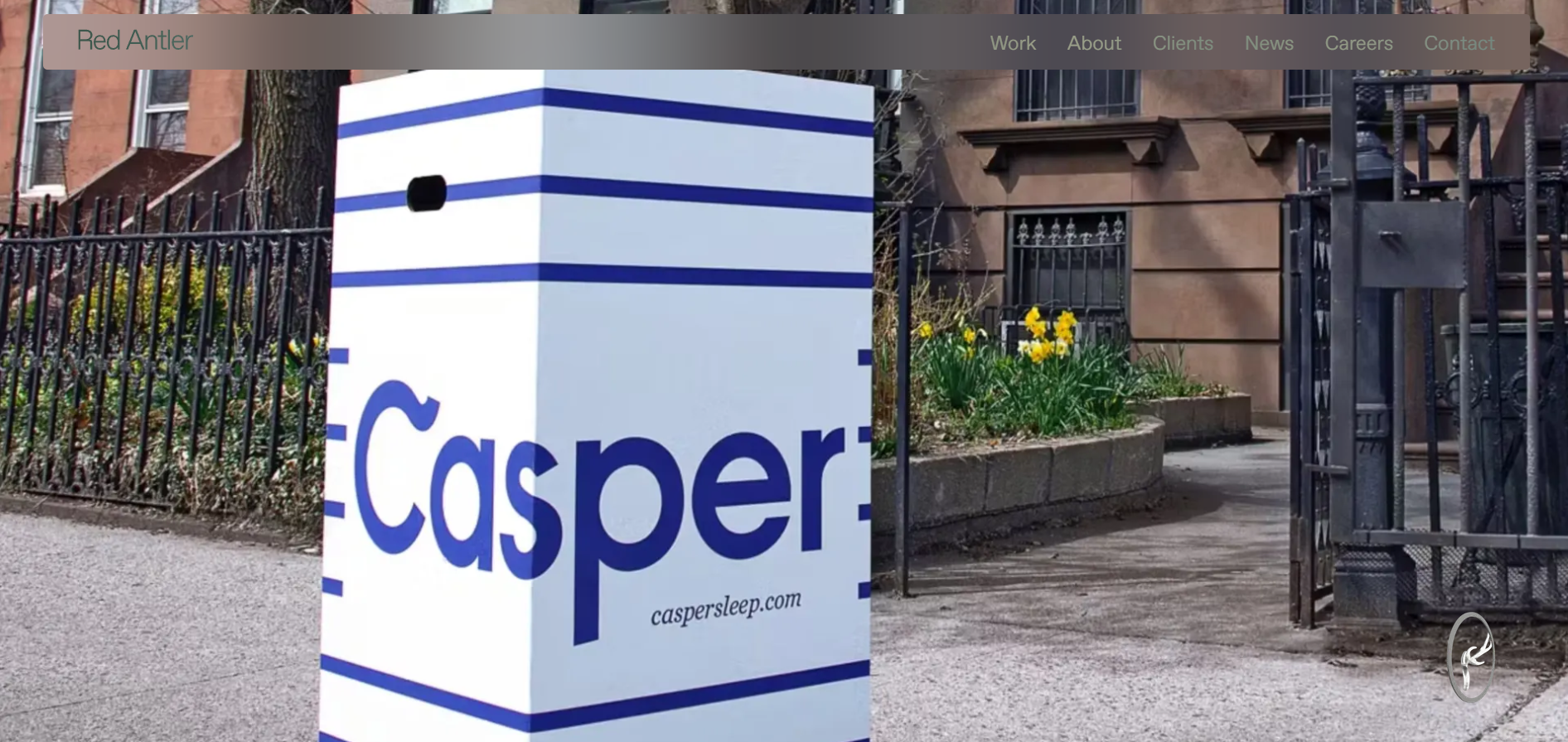
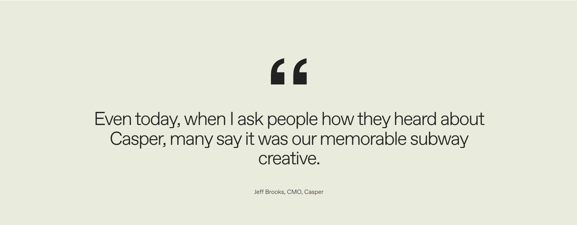
Casper's brand book combines strict visual restrictions with unusually vivid tone of voice documentation. The bespoke illustration style is front and center, with clear rules for when illustrations can appear, what style variations are acceptable, and how to distinguish approved imagery from generic licensed stock. The brand voice section captures a specific personality: warm, slightly irreverent, never clinical. For a brand selling in a category (mattresses) where most competitors use identical functional messaging, the brand book is what makes Casper recognizable from a single ad. Personality as a brand asset, documented systematically.

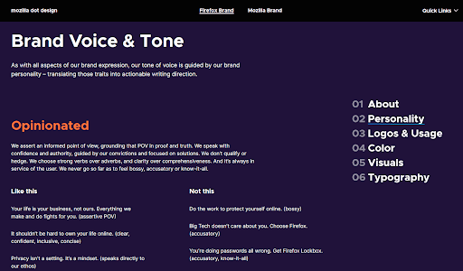
24. Firefox
Firefox's brand guidelines are built for speed. Clicking any color in the palette copies the hex code automatically. Quick links to the most-used assets (logos, icons) sit at the top of the navigation rather than buried several levels deep. The dos and don'ts for logo usage are illustrated with visual examples rather than written descriptions, which is faster to scan and harder to misinterpret. Firefox treats usability as a design principle for the brand document itself. For brand books that need to serve large contributor communities who can't be individually briefed, this utilitarian approach is worth copying. At mozilla.design/firefox.

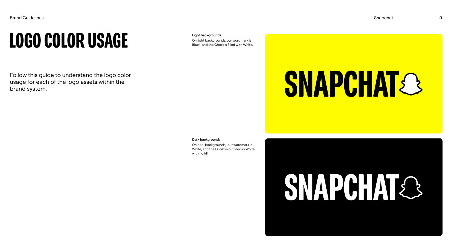
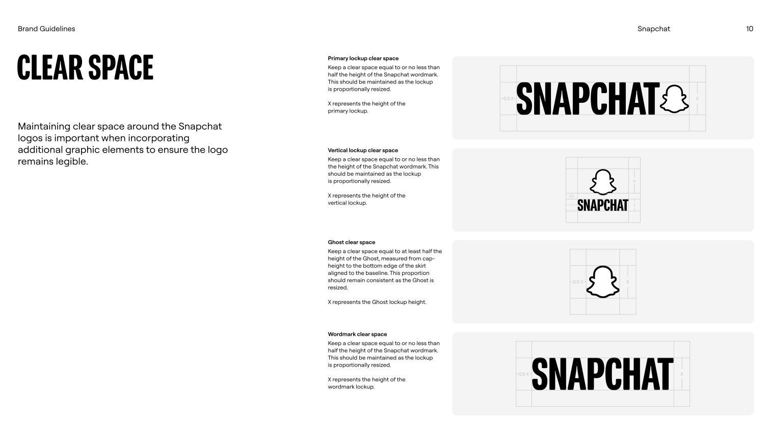
25. Snapchat
Snapchat's brand book is concise by design. It covers logo usage, core colors, and font application. Not much else. For a mobile-first brand where the vast majority of brand touchpoints are digital, that focused scope is the right call: comprehensive coverage of what matters, silence on what doesn't. The dos and don'ts are illustrated and clear. The color rules are simple enough to apply without referring back to the guidelines repeatedly. For any brand putting together a first brand book, Snapchat's disciplined approach to scope is a more useful starting model than a 100-page brand bible.
Frequently asked questions about brand books
Get your brand guide created with ManyPixels
A solid brand book is one of the most valuable design assets a growing business can have. Getting one created doesn't have to mean a six-week agency engagement or hunting for the right freelancer two days before you need it.
At ManyPixels, we've worked on brand design projects with 2,000+ businesses. The brand books that hold up over time are the ones built for the people using them daily, not just for the designers who created the brand in the first place. That framing shaped how we selected these examples.
ManyPixels' brand design service includes brand guidelines as part of the subscription scope. You get a dedicated designer who learns your brand across every request, handles revisions until the document is right, and delivers all source files you own outright. No per-project pricing. No scope negotiations. Unlimited revisions until it's right.
👉 Explore ManyPixels plans to see which tier fits your output needs. You can pause anytime for $10/month if your workload shifts.

I hold two degrees in history, and am currently working on a project of creating a digital library of Medieval manuscripts. I still like to have a foot in the 21st century though, so I write freelance about my other big passion, art and design. All Lord of the Rings references and puns I make are intentional.

Top-quality designers
A complete creative team at your fingertips: graphic and web designers, illustrators, and more.

Lightning-fast turnaround
Get start today and receive your first update on the next business day.

All-inclusive pricing
Unlimited requests and revisions. One flat monthly fee. No surprises.

Flexible & scalable model
No contract. Scale up and down as needed. Pause or cancel at anytime.
Continue reading

Explore some of our best designs
Get inspired by a curated selection of ManyPixels work. Download the portfolio to see what our team can create.